
Forty-five trending colors that bring joy, serenity and focus to the mind, body and spirit. That is the theme of the 2020 Sherwin-Williams Colormix® forecast. This year’s standout hues are expressed through five inspirational and balanced color collections that warmly welcome a new decade in residential and commercial design: Alive, Mantra, Play, Haven and Heart.
Alive
Be present. Be positive. And relish the moments of this amazing life. Enjoy it in an authentic space touched by a palette whose colors keep good company. Here, nurturing neutrals are artfully arranged with rich blues and a deep, ripe olive, evoking a satisfying and rejuvenating sense of community and living well.
Influences: Optimism, Authenticity, Glocalization, New Local
See all the colors in this collection
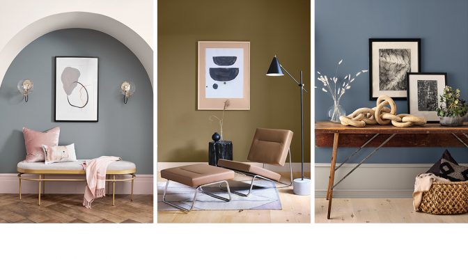
Mantra
East meets West in this palette, and both styles have entwined in the most appealing way. Now Nordic simplicity happily engages with the order and elegance of Japanese aesthetics to create a look that is the best of both worlds. With softly muted neutrals that glide from warm to cool, it embraces all that is simple yet utterly essential.
Influences: Minimalism, Serenity, Scandinese, Sanctuary
See all the colors in this collection
Play
Tag. You’re it. These buoyant colors extend an invitation to jump
into the game and have fun. Energetic and clever, this palette packs
a lot of charm. Starting with a fresh, pure white, it’s peppered with surprising pops of brightness. Its mission is to add humor and warmth to all it touches – and to help us recall that deep down, we’re still kids who love to play.
Influences: Escapism, Humor, Joy, Energy
See all the colors in this collection
Heart
A confluence of genres and emotions permeates this palette.
It’s a unique fusion of iconic modern design mixed with an intergenerational boho vibe. The result is a collection of colors that harmonize amazingly well. From silky earth tones to clove and soft coral, these nine colors are a meditation on comfort, connection and the pleasures found in the everyday.
Influences: Bauhaus, Bohemian, Fusion, Humanity
See all the colors in this collection
Haven
Like being welcomed home with open arms, this palette beckons to those seeking an oasis. Inspired by Earth’s seasonal cycles, it features richly subtle shades of sea, sand, forest and sky. An innate reminder that sometimes real beauty lies in the spaces outside the lines and calm comes from knowing perfect isn’t the only way to be.
Influences: Simplicity, Wabi-Sabi, Conservation, Material Health
See all the colors in this collection
This article was originally published in the Fall 2019 issue of Pintor Pro magazine. Find more color resources and ideas at the Sherwin-Williams contractor website.


