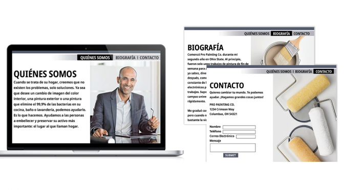
Is your website working as hard as it can for you? We asked Al Pirozzoli, a New York-based marketing consultant who has advised many professional painting contractors, for some fast ways to improve your site.
He says three commonly overlooked pages hold golden opportunities for you to connect with prospective customers: your about, bio and contact pages.
1. Your About page
First off, the About page isn’t really about you. I know that sounds strange, but hear me out.
Your About page is actually about the visitor who clicks the link to see it. Your job is to write information that:
- Talks to the visitor about why they should invest time reading your information.
- Addresses the problems you can solve, and in what ways you can help support their needs.
- Gears your words to address their interests.
- Defines what it is that makes your business different in a unique way and how that benefits them.
- Helps “humanize” your business. It’s a personal message, not a business message.
- Forgets about lists of services here (do that on your Services page).
2. Your Bio page
Every business has a story to tell. There is someone who started it all and struggled to make the business a reality. People love to hear how those challenges were met and overcome. They’re drawn to the passion that built your business. They’re drawn to stories.
Amazing but true: the human mind relaxes when a story is told. Multiple studies have shown that stories encourage people to keep reading because it resonates with them. That’s when a person is most receptive, so don’t lose them now.
So, break out your storytelling side and create descriptive intel- lectual and emotional content that engages readers to believe in you, take action and work with you.
3. Your Contact page
Somehow, groupthink has commandeered the web world. “They” think that About Us, Bio and Contact Us pages should sound formal.
In fact, most businesspeople find it easier to trust real human beings talking straightforward rather than words that sound like they came from a computer-generated software program. This applies to your Contact page.
For any number of reasons, there are many people who enter your site by looking at your Contact page. That makes it a great place to include a condensed version of what you offer to support what they need. Make it more than just a contact form to fill out with your list of contact information.
This article was published in the Winter 2020 issue of Pintor Pro magazine. Get more growth and management tips for your business in the Pintor Pro magazine archive.


