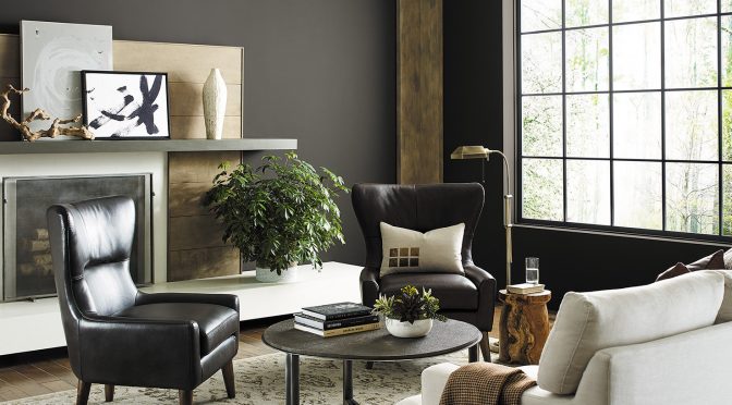
Urbane Bronze SW 7048 (245-C7), the Sherwin-Williams 2021 Color of the Year, is a warm, sophisticated bronze, a color that inspires us to find sanctuary in any space. Urbane Bronze is a rich anchor that grounds the mind in calm and stability with its ties to the natural world.
“The home is now the ultimate retreat from the world, and color is an easy and effective way to create a personal sanctuary space for mindful reflection and renewal,” says Sue Wadden, director of color marketing at Sherwin-Williams.
The “stay at home” mantra has directed where we go and what we do in 2020, but it will also influence interior design trends for 2021 and beyond. The color is part of the Sanctuary palette in Sherwin-Williams 2021 Colormix® Forecast, which predicts a need for balance in design for the year ahead. The new decade ushered in a return to rich, bold colors, stepping away from the cool neutrals of the 2010s in an effort to bring more personality into residential and commercial spaces.
“Urbane Bronze is a comforting color, drawing from nature for a feeling of relaxation and serenity,” Wadden says. “There’s also reassurance in its sentimentality, with nostalgic ties to the design of the ’70s and ’90s, but with gray undertones that give it a distinctly modern twist.”
The new neutral for the home
Bold and understated at the same time, Urbane Bronze is the new neutral that can be used anywhere in the home, inside or out. Whether used as a primary or accent color, Urbane Bronze has an anchoring quality that conveys a sense of comfort and sanctuary in bedrooms, living rooms and dens, or calm concentration in home offices.
For an updated take on minimalism, pair Urbane Bronze with other warm neutrals, such as elegant bone whites like Modern Gray SW 7632 (283-C1). To bring in more color and a hint of the bold pairings of the ’70s, add a modern green like Messenger Bag SW 7740 (297-C7). A monochromatic look with Urbane Bronze on all four walls and trim creates a soothing site for working from home.
Nature-inspired commercial properties
Urbane Bronze complements the current trend in the construction industry toward biophilic design. The idea is that because people spend so much time indoors, it’s necessary to bring the outdoors in and create indoor environments that reference nature in both obvious and subtle ways. Biophilic design will continue to play an important role in commercial spaces. Rooted in nature, Urbane Bronze is an ideal accent color.
“Urbane Bronze is just one more way to bring in nature and is a great color to accentuate window trim, columns and accent walls in commercial spaces,” says Wadden.
Sue Wadden leads the Sherwin-Williams global color and design team to research and identify key trends that influence the way people interact with color. From those findings, the team turns emerging themes into the annual Colormix® Forecast and zeroes in on a Color of the Year. For more color ideas, tools and resources, visit swcolor.com.


