
The Sherwin-Williams Commercial Colormix Collections are a great resource that can help you assist your customers with color selection for all their jobs, from hospitality and healthcare to education and multi-family properties.
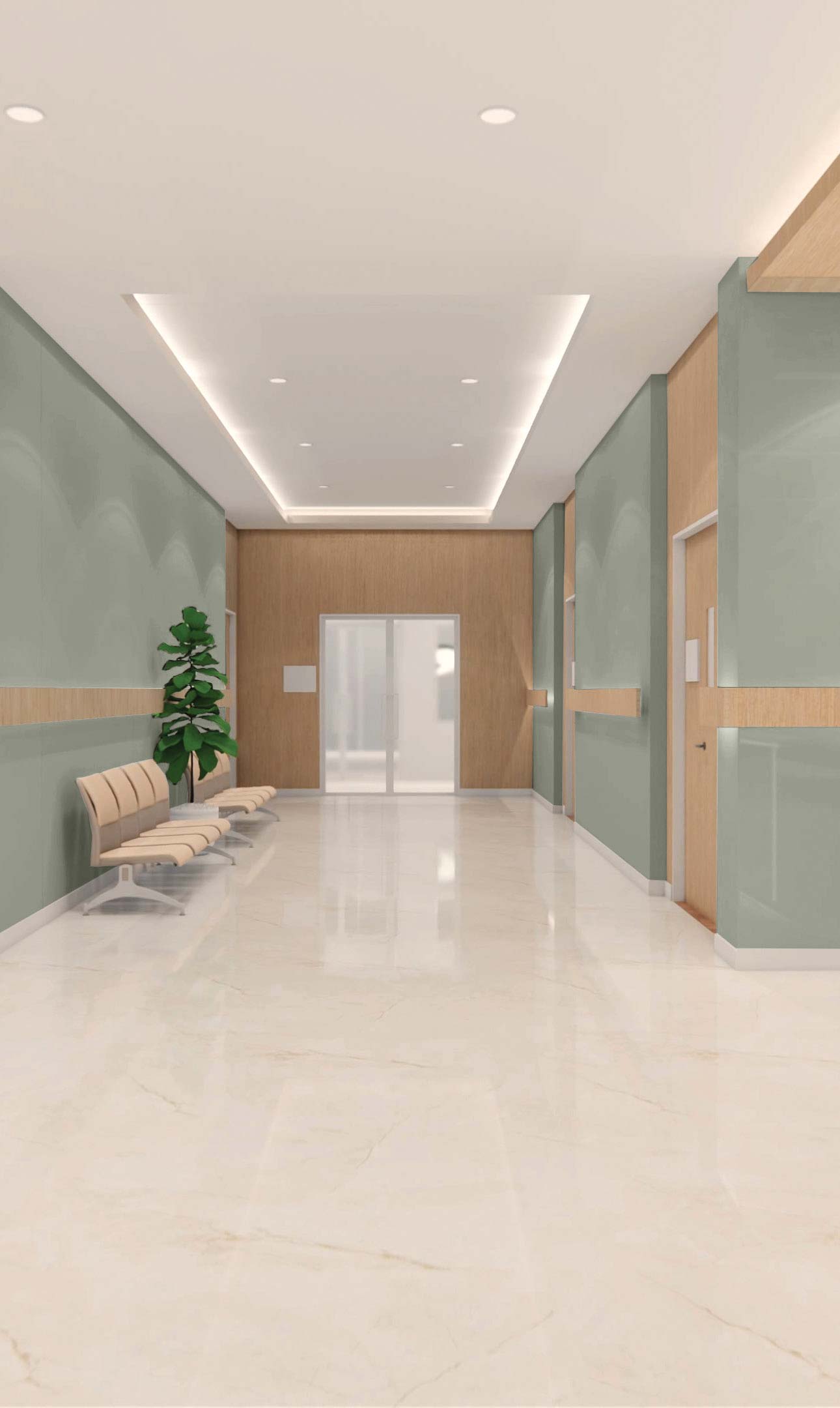
Healthcare
Great importance on both physical and mental health continues to be a major focus in all of our environments – work, home, school and especially our healthcare facilities.
Many centers are exploring new approaches to wellness through a variety of therapies. Softened tones are great in these areas as they provide a light airiness to these restorative environments. For pediatric spaces, bright and joyful pops of color add a sense of fun to an otherwise sterile environment.
Applied as an accent, a mural or even a color gradient wall treatment can all act as a positive distraction or as a helpful wayfinding technique.
As neutrals continue to warm, look to utilize these as main wall colors as well as lighter wood tones for comforting backdrops in these oftentimes uneasy environments.
Watery blues, eucalyptus greens and soft lavenders also pair beautifully with those lighter wood tones and crisp white surfaces.


View all the colors in this palette
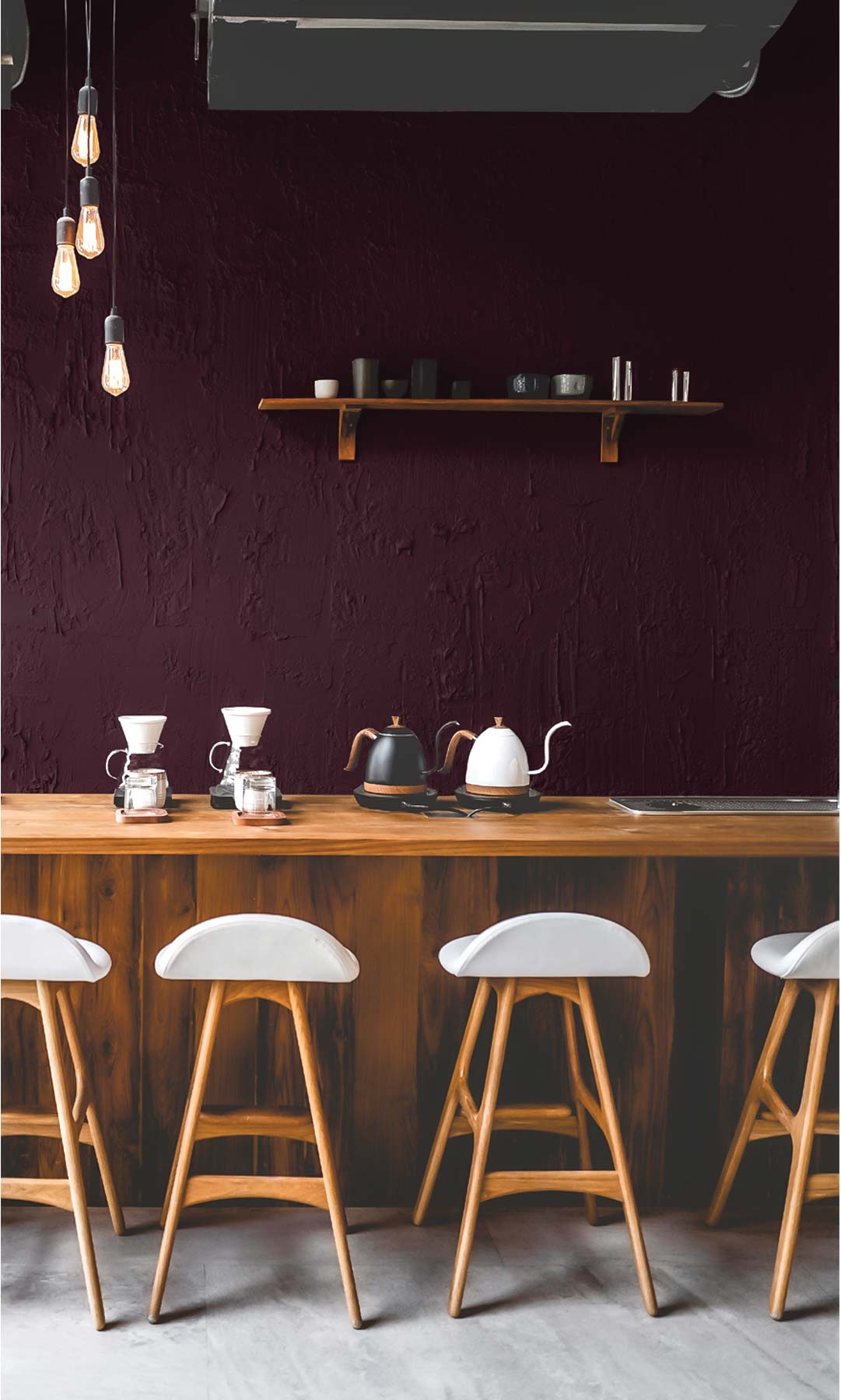
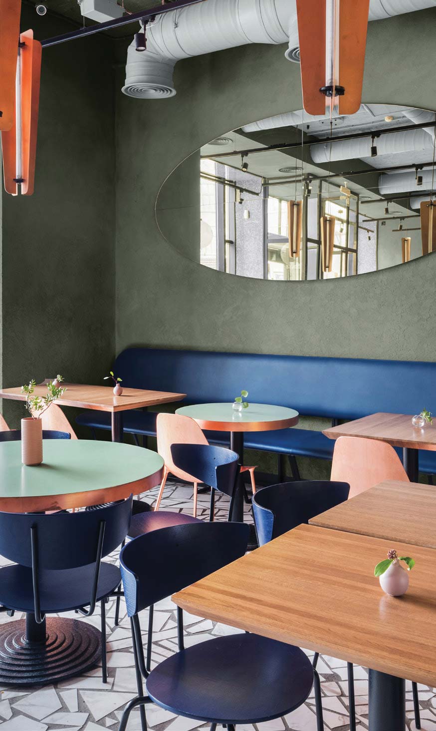
Hospitality
Influences of the hospitality market include nostalgia and eclecticism as well as the latest trend of “cottagecore,” an appreciation of nature and a wholesome way of living.
Grounding earth tones such as deep terra cottas, lush greens and golden wheat tones allow these finishes and design elements to be the main focal point. Creamy linens or warm oat tones on the walls provide a beautiful lightness to any room or space.
Luxurious grandeur with an edge is also influencing and shaping the hospitality market. This design aesthetic includes diving deep into the moody tones of luscious purples, rich navy and bronze placing them strategically on walls to create the biggest impact.
View all the colors in this palette
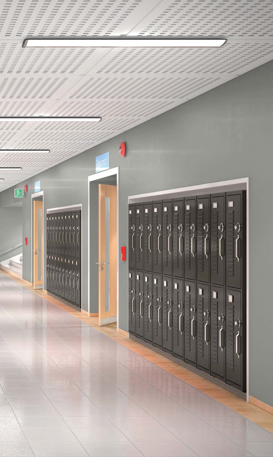
Education
This collection of colors curated for the education market is full of bright pops of color along with a palette of light neutrals that provide a soft background for classrooms and school corridors.
Incorporating school colors or other fun colors in strategic applications aid in wayfinding for younger students as they navigate through their school hallways. Embrace an environment that encourages creativity and collaboration with colors that are both mood-boosting and welcoming.
In order to attract new students, higher ed facilities and universities strive to be on the cutting edge of design. College-aged students have taken an interest in more of a retro design aesthetic, with happy ’60s sunny yellow tones to denim patchwork and floral tapestries.
A more structured look is also popular with students leaning towards a sophisticated palette of neutrals such as soft creams, classic navy, deep charcoals.


View all the colors in this palette
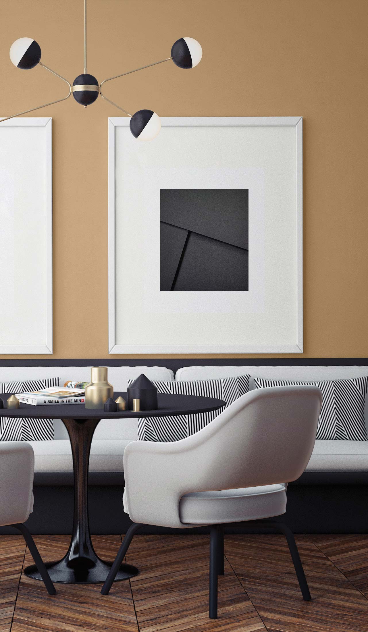
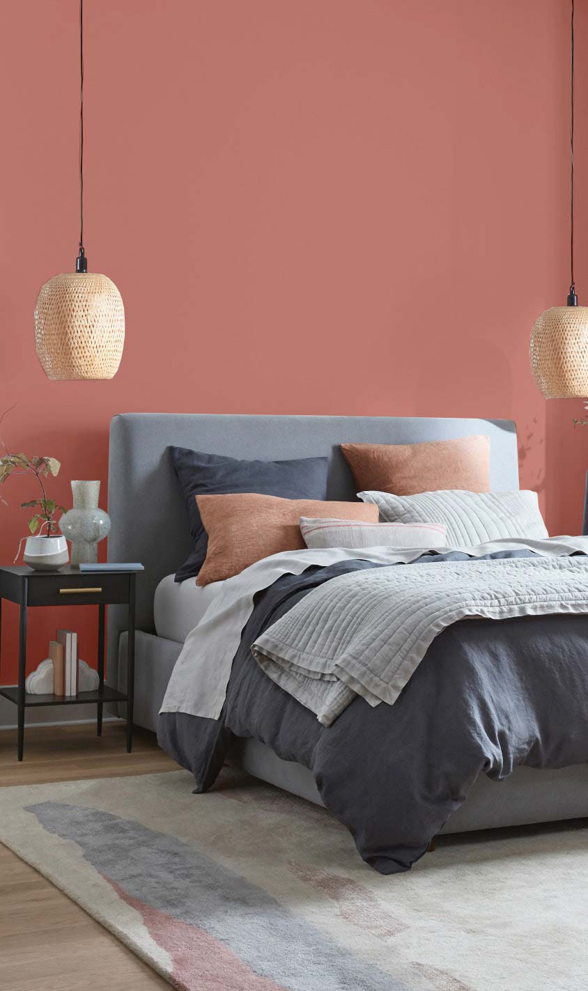
Multi-family
With the continued flexibility of working from home, creating a custom personalized space has become an essential part of the multi-family experience. Whether it be a shared area or an individual unit, the multi-family inspired color palette was developed to meet these versatile needs.
Warm neutrals and creamy whites act as foundational backdrops in our ever- changing, multi-functional homes, from classrooms and bedrooms to offices and even gyms. Bright, fun pops of color can be used to liven up a social space or lend creativity to a unit’s individual personality.
Just like any other type of residence, up-to-date and appealing exteriors remain important to creating an inviting living space. Color continues to play an integral role in this process. Applying a pop of blue or green to an accent feature to create a modern look, or using soft, warm neutrals to evoke a classic and clean feel help to elevate a building’s curb appeal.

View all the colors in this palette
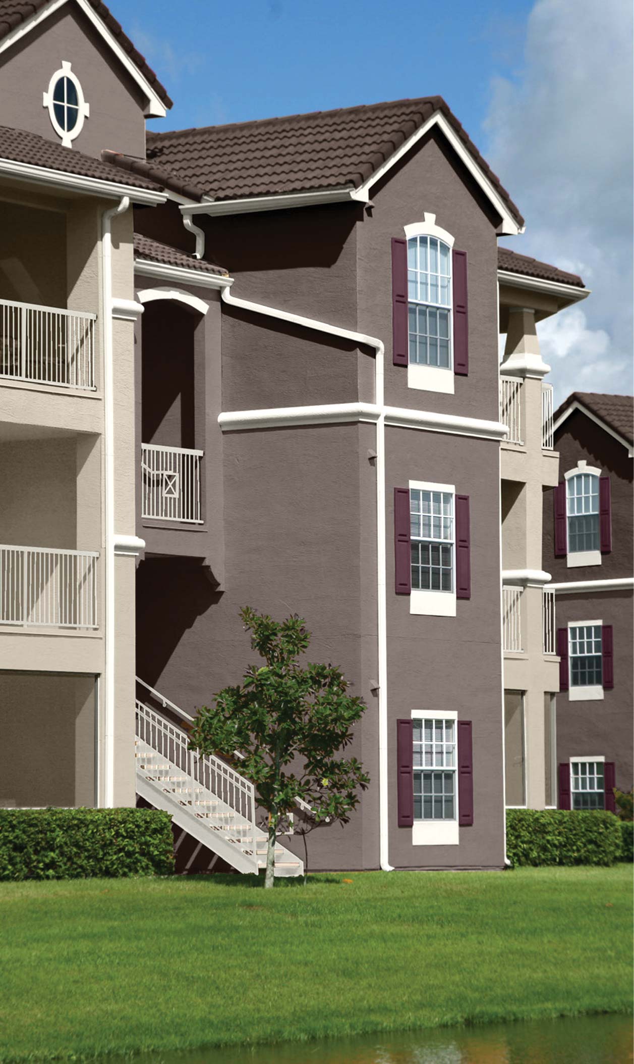
New residential
Throughout the pandemic there has been a huge migration from city to suburban living. This migration has created more demand for the single-family suburban house. A classic palette of colors rooted in tradition, nostalgia and optimism set the tone for this collection.
These colors are comforting, familiar and rich in depth, allowing home buyers to create the home of their dreams while also adding a dose of individuality.
Highlighting bolder shades as accents for doors and shutters, and keeping the body of the house exterior in a neutral or lighter color can create a home full of personality. For the more modern look, the pairing of a dark rich iron trim color with a clean white siding provides a simple yet stunning look.


View all the colors in this palette
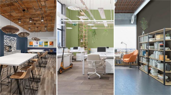
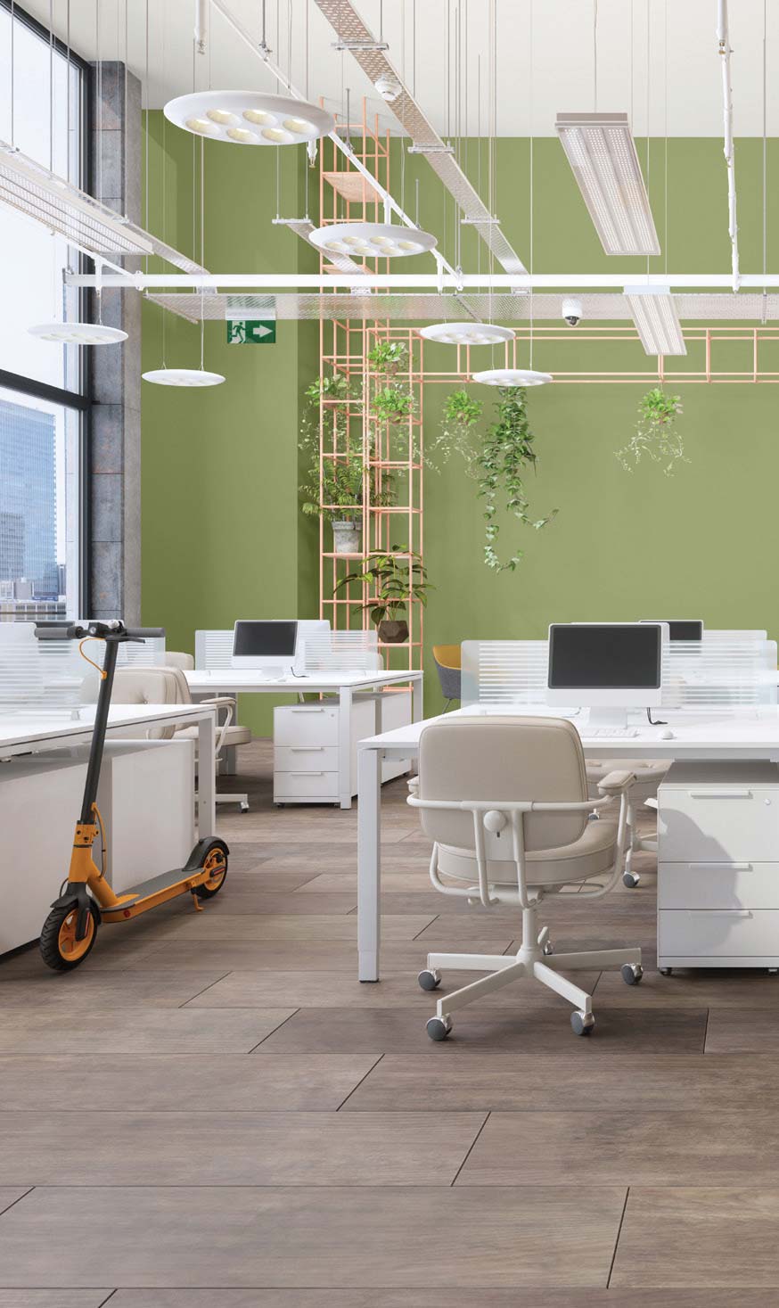
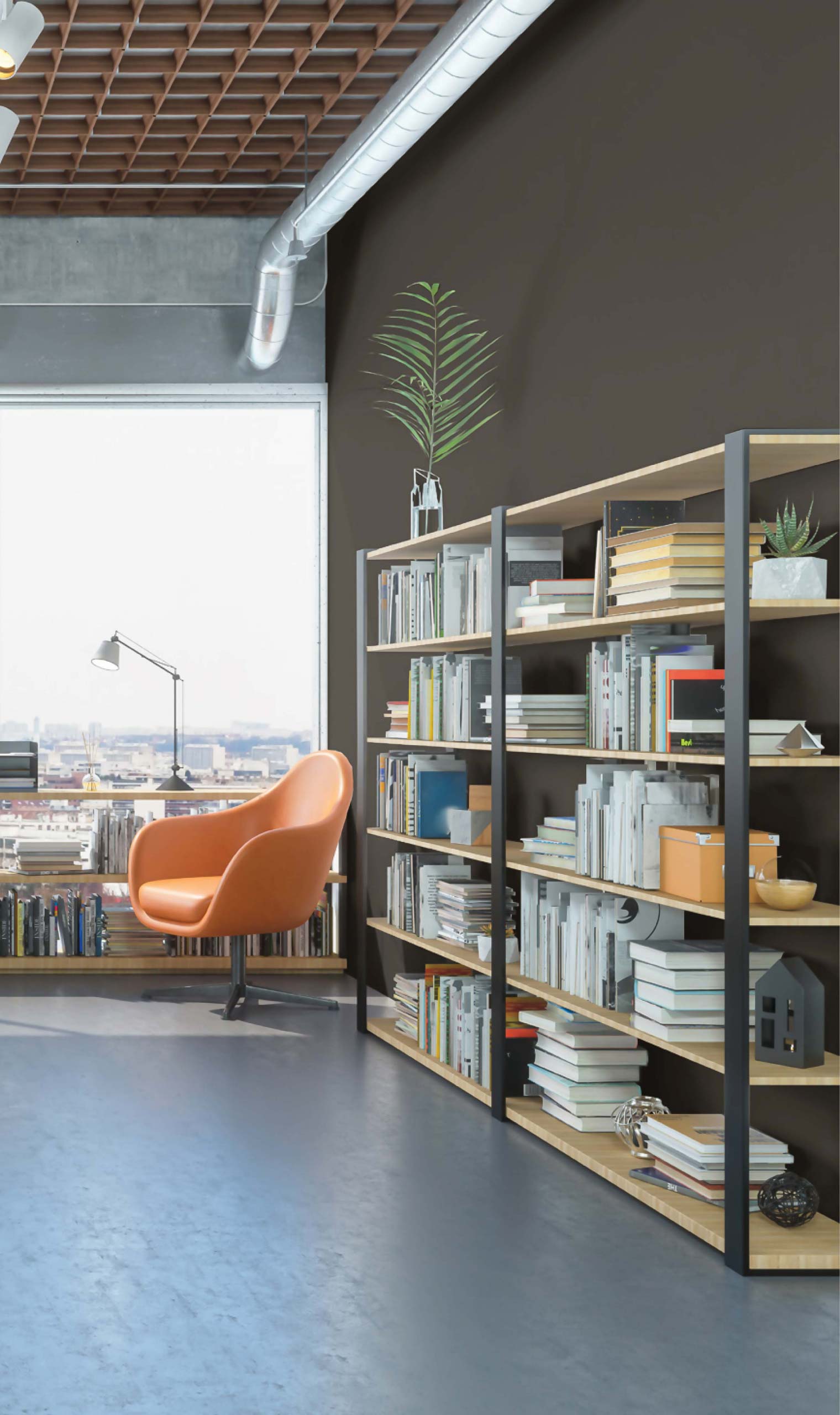
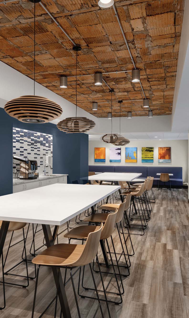
Commercial
A well-rounded assortment of neutrals provide a comforting atmosphere for employees returning to in-person work.
Employers are also looking to boost their interiors by showcasing a bold display of colors that are punchy, bright and have a lot of depth.
These colors bring out the beauty of plants, artwork and can also act as a branding element for specific departments or areas within an organization. Pair these bold colors with concrete grays, bright whites with black and polished or matte metal finishes in silver or brass.
View all the colors in this palette
For more color ideas, tools and resources, visit the Pintor Pro magazine archive.


