
Contrary to popular belief, your website is not about the products you sell, the services you provide, or the information you share. It’s actually about the people who visit it and their needs. As a website owner, your job is to turn those visitors into paying clients. But before you can do that, you have to keep visitors on your website for long enough to pique their interest. And that means not scaring off your prospects with features that are annoying or — even worse — that could make you look unprofessional.
With all the web-design elements available today, it’s easy to lose sight of what will work best for your target audience. However, once you shift your focus to serving your visitors instead of your own needs, avoiding these features becomes much easier.
Here are five website features that may be working against you:
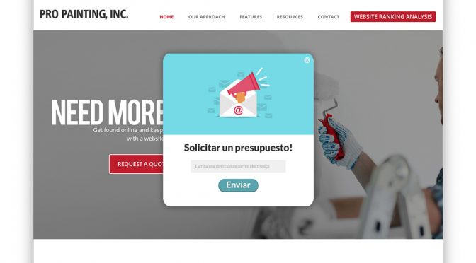
1. Aggressive pop-ups
Pop-ups come in all shapes and sizes. Some are intended to persuade visitors to interact with your call-to-action (“Sign up for our newsletter” or “Take our survey”), while others are paid advertisements to bring in some extra income. But, let’s be honest, pop-ups are quite bothersome, especially if they appear repeatedly. Expect to lose visitors if they have to spend more time closing pop-up windows than exploring your content. If you feel you need to include pop-ups on your site, make sure you do your homework, place them well, and use them wisely.
2. Translation plug-in
Translating your website into other languages is a smart business move if you are looking to expand internationally. It makes your products or services available to more people in more places and may very well increase your sales and online success. While it may seem like a translation plug-in or machine translation service will save you time and money, think twice before taking action. Machine translation systems are great at getting the gist of a text, but often skew the meaning. For example, in some languages, a popular machine translation tool translated “US President” as “Bush” well into the Obama administration. To avoid embarrassing mistakes that scare off global customers, make sure you hire a professional translator who can perfectly craft your message for your audiences abroad.
3. Autoplay video
It’s happened to every Internet surfer out there. They arrive at a new website and an unfamiliar voice or loud music blasts through their speakers.They frantically stop the video, rub their sore ears, shake their fist at the screen and close the tab. Video may be all the rage right now, but the secret lies in knowing how to use it effectively. Autoplay videos—whether for informational purposes or to bring in revenue from advertisers—are annoying and
will often push visitors away from your site. If you plan on using video on your website, add a prominent play button instead of having it autoplay. Let users decide whether they want to watch the video instead of deciding for them.
4. A dysfunctional mobile version of your website
Mobile Internet usage now surpasses computer usage. This means that you must have a mobile-friendly version of your website that maintains all the same key functions as the desktop version. If visitors do not have a positive experience when they land on your mobile site, you may drive away a huge portion of potential traffic. So, make sure your website is responsive. Responsive websites include all the same content and information on any device used to access them, but the display changes automatically based on the size of the viewer’s screen.
5. Infinite-scrolling home page
Infinite scrolling is a design technique in which content continuously populates at the bottom of the screen as the user scrolls down the page. This technique can be very effective for certain types of sites, but for most, an infinitely long home page can be distracting
and confusing. It increases load time, makes navigation and linking messy, and hides or eliminates the highly valuable website footer. Users often search the footer for contact information, social media links, and privacy or security notices. If you’re not sure what type of home page will work best for you, consult a web-design professional to learn what works best with your target audience.
Whether you are a freelancer or you own a multi-million-dollar company, all you have to remember is this: make your website for them, not for you.
This article was written by Molly Yurick, a Spanish to English translator specialized in tourism, hospitality and airline industry translations. She is also an active volunteer for the American Translators Association. The American Translators Association represents over 10,000 translators and interpreters across 103 countries. Get more business-building ideas for your paint company at the Sherwin-Williams contractor website.


